Please can someone help? The layout of a diagram does not look the same on two different computers.
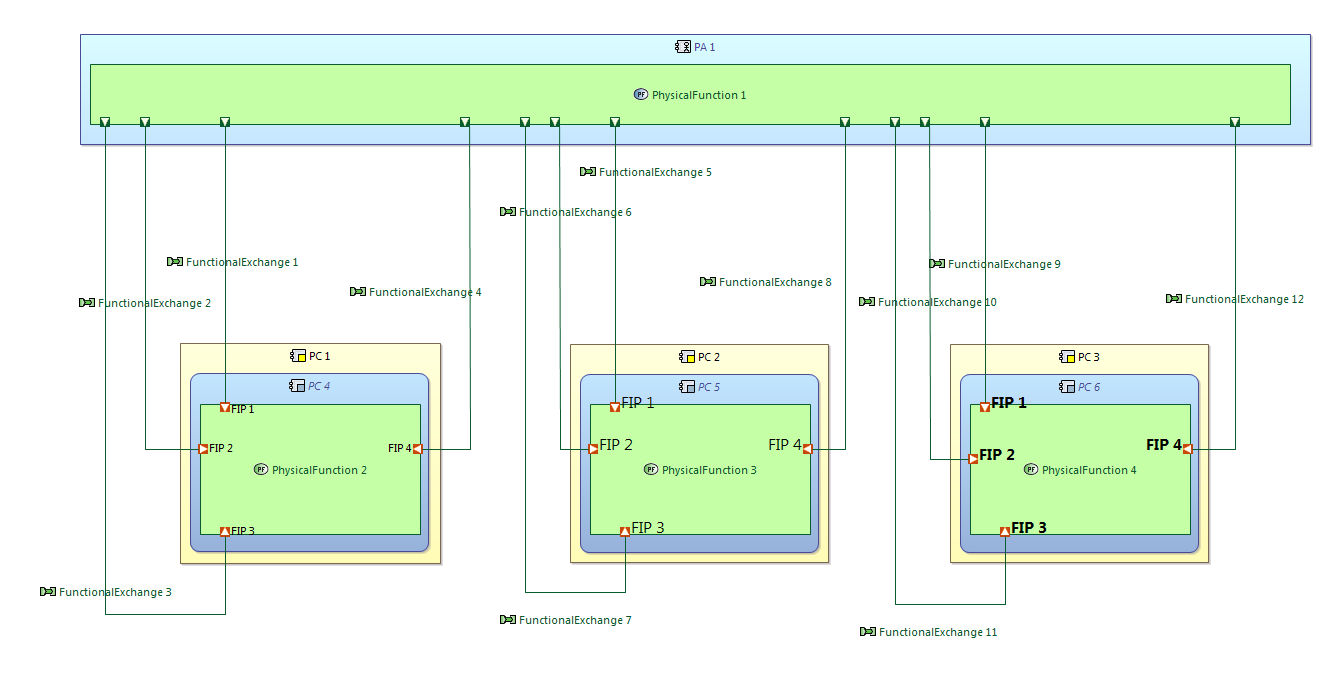
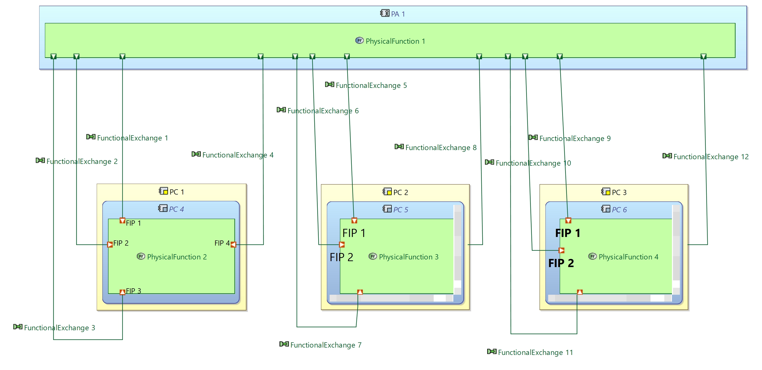
A Capella model was exported to an archive and sent to a colleague. After they had imported the model to their workspace and opened it, one of the PAB diagrams did not appear the same.
Two things seemed to change on their computer:
- the font sizes appeared to be different
- the port labels (which were made visible) had moved to a different side of the port
The problem with this was that some of the function port labels moved too close to the border of the Behavior Component. This caused the scroll bars on the Behavior Component to appear and effectively “move” the Function on the diagram and making it difficult to read. The knock on effect of the Function moving is that the lines for the Function Exchanges also moved and further messed up the layout of the diagram.
This is obviously a problem as I want to be confident that the layout of diagrams will always be consistent, no matter which computer it is opened on.
Has anyone seen this happen before? Where, after manually changing the font sizes in a diagram or making port labels visible and positioning them, that their formatting/positioning is not the same when viewed opened on another computer.
Please note that both computers were running Capella 1.2.2 with exactly the same build number and plugins.
Is this a bug or could it be something I have done accidentally?
After some experimenting we have found that Port Labels do not always behave. It seems that Capella does not always allow you to move the label to all 4 sides of the port it is attached too. In some scenarios Capella only allows for you to place the label in the North/South positions.
I have not yet been able to identify exactly how to recreate this behavior. Currently the label placement behavior appears random. But if I can work it out then I will let you know.
Therefore my working hypothesis is that when my diagram was opened by my colleague, this North/South only rule was enforced, moving the labels and then effecting the rest of the diagram layout.
Can anyone else please confirm if they have also seen this North/South only behavior for port labels?
However, we are still seeing a change in Font sizes which is not yet explainable.
James,
I have asked my internal teams, let’s see if they can find a possible explanation for this.
Stephane
Hello,
Can you verify that the Font used for your diagram is available on the computer of your colleague? This is a required condition to guarantee the same layout on both computers.
To see the used Font:
- On a diagram, select an element. In the “Appearance” tab of the “Properties” view, you can see the name of the used Font.
- In the preference, you can change the Font used by default (Preferences/Sirius/Sirius Diagram/Appearance).
The below information are complementary. Because I think that the root cause is the Font problem.
In Sirius 6.3.0 (version used in Capella 1.4.0), there is an issue, bugzilla
550382 , to allow to locate “everywhere” a label around the node (or the border node). I think this is linked to your North/South problem. Unfortunately, this issue has been reverted in Sirius 6.3.1 (bugzilla
561385 ) because it has side effects. The version 6.3.1 will be included in the next version of Capella (1.4.1). By the way, we had not noticed a change of location between two computers.
Regards,
Laurent