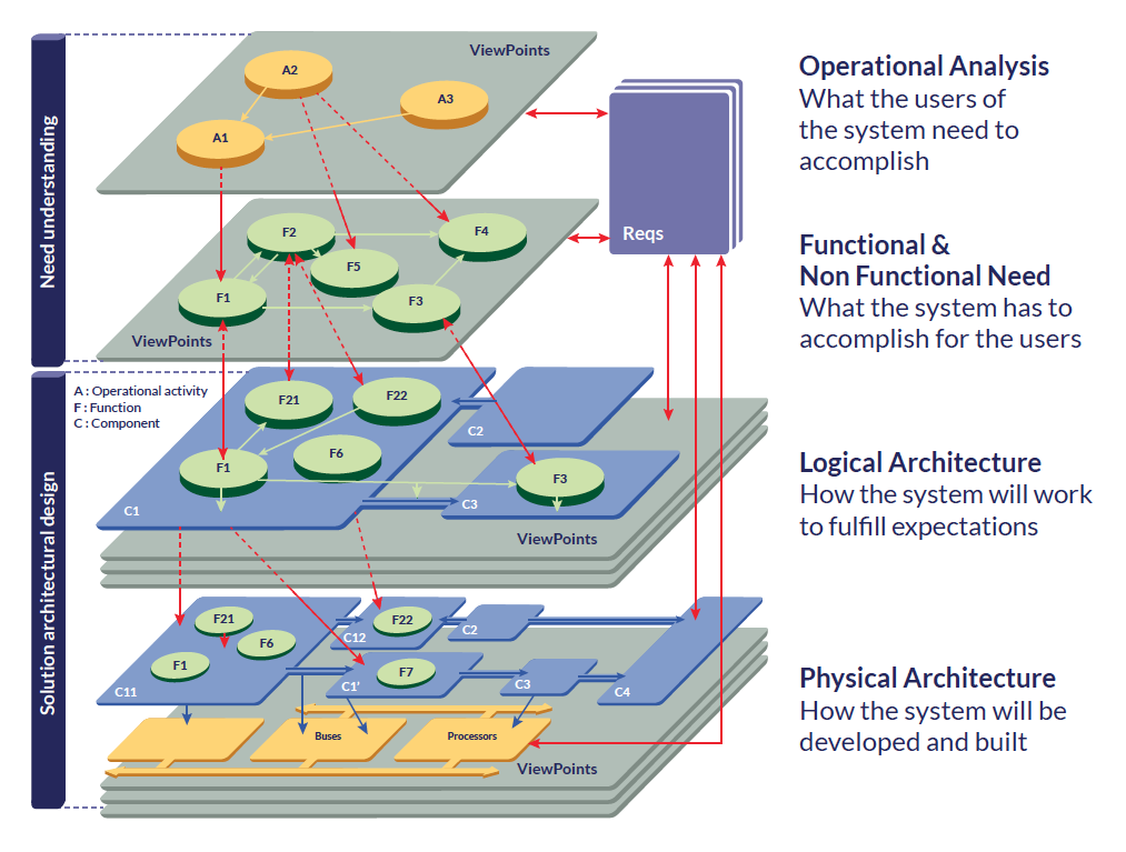
I am posting this with the feeling it has been posted before - although I couldn’t find it. Is there a way (maybe outside capella even!) to make a visual representation to show mapping of elements between layers? I.e., similar to probably the most famous picture in the Capellla universe: https://mbse-capella.org/images/arcadia/phases_arcadia.png
I know we have the traceability matrixes… but a visual alternative would be interesting… to transverse the model.
hi @HelderCastro , thanks for the pointers. What some colleagues asked me was a visualization. With the ontology they will understand how things are connected… and surely through the semanting browser we can navigate the model. I understand they would “like” a vision exactly as expressed by the picture I linked. On second thought, maybe it would provide a huge graphic nice to see the complexity but of little value for concrete engineering work.
@rreis thanks to hear the link I share was of value.
When I present to other I do use both figures, as captured in the webpage I shared.
You can explore other pages for Operational, System Needs Analysis, and Logical and Physical Architecture, at the end of each of them it is captured a traceability and flow of model elements and diagrams, for example, Operational Analysis traceability flow.
Not sure what you mean by: “On second thought, maybe it would provide a huge graphic nice to see the complexity but of little value for concrete engineering work”